Grey and mono website designs
Friday, 24 August 2012
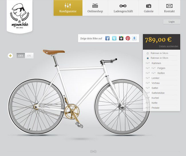
My Own Bike
Stunning site, the bike is elegantly displayed with a perfect mixture of little icons and grey tones.
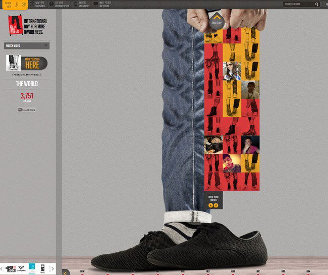
Lend Your Leg
Splash of colour on this one so not a 100% grey site however what great use of the browser window space. The touches of UI are also placed in neat places with an overall cracking looking site.
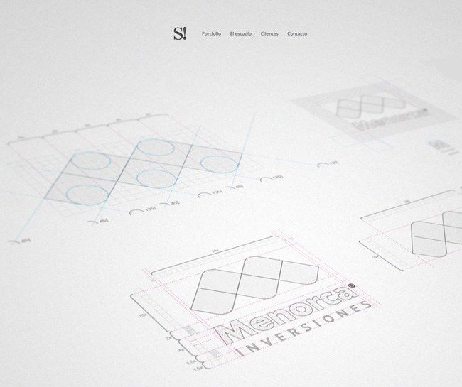
Smart Group
Vertically navigating site which is very clean, nice use of the logos in grey on the clients area.
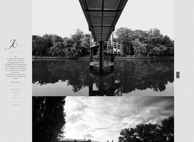
JC Photography
Love the vertical pre-loader then the way the site opens up from the middle. Another example of a vertically navigating site which is becoming more popular for the funkier end of the market place, e.g. photography and studio sites.
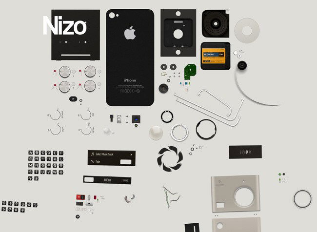
NIZO App
Just scroll down to see the parts of the phone move together is a brilliant piece of screen movement and the way the logo drops in, love it.