Inspirational website footers
Friday, 5 October 2012
It's not something that you would usually look for but a good website footer is always the finishing touch to a site. They used to be thin strips with just a few links in but now most designs utilise a large footer area using it as additional page space to link all over the site and also for social media. They have become hugely important on sites and with that comes some great ways of doing them. I took a look at a few examples from around the web.
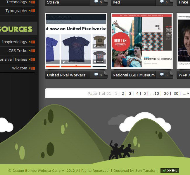
Design Bombs
Nice starting one, not a huge footer in comparison to others but it begins the theme of having a nice base to the website as opposed to just white space.
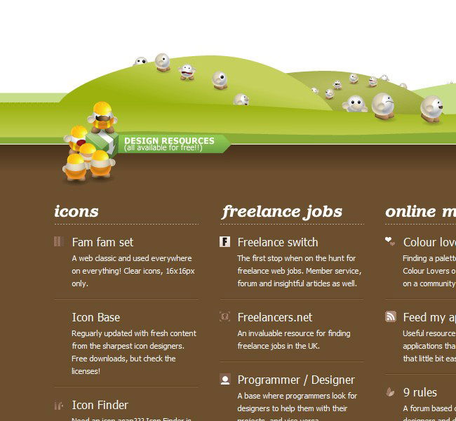
Yo Div
This is more like it, its quite similar to the Way Fresh one in that you can see the soil underneath, i always like to see the links with a little intro under them, its a pretty big website footer but it fits in well with whats above it.
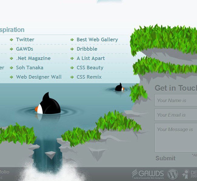
Branded 07
What a brilliant use of space, the small form on the right hand side fits in nicely. Apart from the footer the site is quite plain however this website footer adds a big chunk of funk to this one!
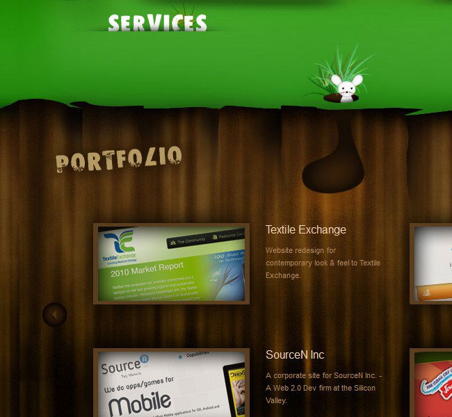
Yodaa
Its another soil one! This ones has much more vibrant and slightly darker tones of colour and the footer goes down much deeper, i like the little wooden sign at the bottom and we are actually doing something slightly similar on one of our pages at the moment. Our character chick will be standing on top of a contact us wooden sign very soon.
Blup
I like the footer but not the rest of this one, seems a tad thin and its a bit too content heavy with way to much white space. However we are looking at footers and this is a nice way to do one that doesn't involve grass!.
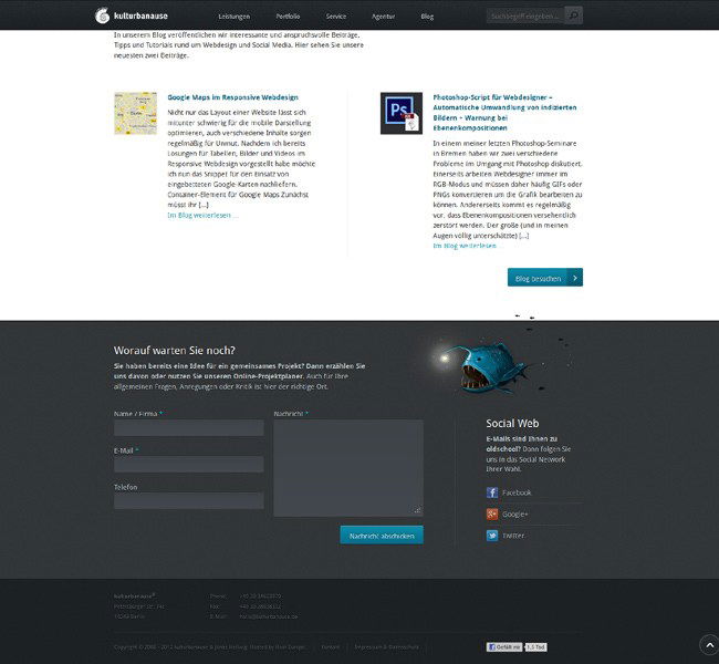
kulturbanause
More of a classy design opposed to the ones above so a slightly more uniform footer here, nice use of mouse over colours and the placement again of the social media bits is just right.
Thanks for reading, anyone that has any other footer designs they want to share please feel free.
